
I think that my favourite has to be the bottom left as I think it has a more pleasing composition and the text works well at a smaller scale. I began to think of how I could move it away from a black and white design, and how I could bring more visual focus to the logo.
Foiling:
After looking at some business cards, I really liked the technique foiling. It is a clean, eye catching enhancement to a design which helps highlight it's beautiful simplicity. I feel this technique would represent me well as I like to keep things simple and engaging. If I used this technique for my logo I feel it would help me stand out, in a quiet way that isn't too over the top and boastful. Below are some examples of foiling that I really engage with.


Before I try out this technique properly I wanted to see what it potentially could look like by mimicking it in photoshop:


Embossing:
Another approach that I really liked due to it's simplistic nature is embossing. It helps to enhance the three dimensional look of the print, it makes people want to run there fingers across it and take a proper look. Below are some examples of embossing on business cards.


Again I wanted to see a digital interpretation of this technique so that I don't wast time and resources doing it if I don't like it.

I then began to look at ways different ways I could present myself:

I really wanted to incorporate packaging into my design because of my passion and love for packaging design, it is also something I hope to go into as a career. For this reason, after seeing a happy meal box I remembered how my first ever job was working at McDonalds and I worked there for just under 3 years. I thought it would be quite nice to pay homage to that being my first job and where I'd potentially like to be with my career in the future. Therefore I would like my self-branding to be packaged in a similar box to a happy meal.
I found this net online which is similar to a happy meal box:
I printed it out and made it up to see what it looked like:
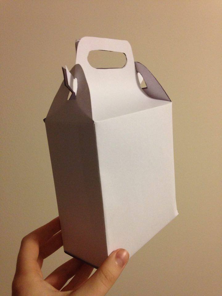


Unfortunately I hadn't noticed that all the sides weren't equal squares, so Im going to take the net into illustrator and create my own from it.
This is the net design that I created:

Unfortunately the first test I did the sides were too short so i've extended to the top handles to see if that works better.
I also decided to print some vinyl stickers as part of my pack:


I decided to print stickers out so that it could potentially become a strong iconic logo, people would recognise the logo and immediately be able to associate it with me.
No comments:
Post a Comment