Thursday, March 17, 2016

OUGD402 Packaging Inspiration

As I have a fond interest in packaging design I have set up a pinterest board full of inspiring packaging designs. This is something I can refer to for inspiration, I can use aspects to work for me in different ways. Packaging design engages and excites me the possibilities are vast in terms of design and shape.

I have chosen to look at a few examples of the types of packaging design that inspires me:

Mama & Boo
A cosmetics and skincare line specifically for mums-to-be. From cleansers to creams to sunscreens, the company provides products with ingredients that are safe for mothers. With packaging and branding designed by Thinkpanther Design Studio, Mama & Boo captures the essence of the joys of parenthood for its products.

I particularly like the pattern design that is created for the bottle labels, the illustrative style and bright colours are attractive and do create this happy mood. I also like the wood lids which suggest that the products are natural - definitely what a mum to be would look for.  They work cohesively with the rest of the design to produce a bright engaging product.


New Tea Ceremony

Designed by Typical Organisation, this line of tea sticks is just as good for a grab-and-go cup of tea as it is for a relaxing cup of afternoon tea.

This modernist approach to the design of tea packaging is really interesting but works really well to show the freshness and modernity in these tea sticks. The bright colours used are bold and striking which goes against the normal muted tones related to relaxation - it provides more excitement and intrigue. The dot pattern gives a sense of organisation and tidiness, much like graph paper. Overall it is a really interesting design that goes against the norm and bushes the boundaries of tea packaging.


The Pams Confectionary Range:

Illustrated by the talented Brett King, the design's naïve style touches on a story book 'look and feel' from simpler times. Each character relates to the product inside and cleverly tells its own story with little details for the consumer to find.

The choice of retro colours and a creamy pack give a sense of naturalness without downplaying the fun. And a gentle reminder that these lollies have no artificial flavours or colours. The characters are fun and engaging for a wide audience both young and old. The display window is also cleverly placed as the characters clothes which adds to the interest and shows layout has been well thought out.

Wednesday, March 16, 2016

OUGD402 Presentation Reflection

On Monday I finally presented my presentation to my small group. I had been practicing over and over with friends and family to assure myself that I knew what I was doing so I have less chance of messing up. Initially I was really nervous and had that horrible sick feeling and I was very shaky. However, from the feedback I received apparently my nerves didn't come across when I was presenting. Because I knew how nervous I was, I tried to project my voice to stop it from shaking. This is really good news to here and it means that the steps I took to help obviously paid off. In the future with more practice hopefully the feeling of nervousness and dread will subside as I get more used to it. I aim by the end of second year to be a lot more confident in myself that I can actually present.

OUGD402 Reflective Summaries on the Studio Briefs

OUGD403 - Logotype:
Overall I really enjoyed this brief, I learned to look at type in a different way, it is usually designed for ease and speed of interpretation and understanding. However a logotype should intrigue the audience, should be meaningful and considered. The composition, spaces, spacing and weight are significant. A well designed arrangement of letterforms within a logotype can and should evoke personality and emotions. These were all the elements that I now needed to consider and look at in more depth and I found this really interesting.

I believe that the logotype I designed is bold and unique to the brand. It reflects a fragrance shop how it is contextually informed and people immediately engage, recognising exactly what that brand does. I think that it is a really cohesive aspect of the design that people when just seeing the logo as well as the name, that it is clear what it is. Although there may be a problem with scale, when applied at a smaller scale the perfume bottle might not be recognisable. I took inspiration from The Body Shop's re-brand and I think this is reflected within my final design. I found this a challenging task as I always struggle to come up with ideas for logos, I find it hard to try and represent a whole brand within one small piece of design. I have also realised through doing this brief that I do not experiment with my ideas enough and this proves to be very limiting. I really need to work on this, but hopefully I will try and focus on that for the next brief, really developing my ideas thoroughly.

In reference to the brief I believe that I did focus on the manipulation of original letter-forms and considered who the company are within my final design. However I should have considered looking to 'refresh' the brand as it already has a reasonably recognisable logo. And one of the major things within the brief that I did not do very successfully is experiment. Overall I think the design turned out well and does meet the brief but I would not say it was 100% successful as I need to make sure I do meet all the brief requirements.

OUGD403 - Typeface Design:
I found this a really challenging task based on the fact that I was unsure where to begin, but once I had got passed that it did become easier. I had a really hard adjective to work with and this is initially where my problems came from. Once I had spoken to others it gave me a lot more ideas to work with and helped me pinpoint which direction I wanted to go in.

The ideas seemed to come a lot easier then, I wanted to reflect wealth and and a large richness. I thought the best way to do this was to embellish the characters. 

I could potentially try and make the swirls bigger and more over the top but within the time scale I did not see it being done and because my skills on illustrator are very basic I didn't want to try something that I wouldn't be able to complete.

From the feedback I have received I think I have achieved my aim of how I see abundant reflected as. People have interpreted my adjective in different ways which is probably the reason why my feedback is reasonably mixed. However, I think that people generally understood my design decisions which is a good thing. 

Next time however I might try to consider how I can incorporate both trying to find more of an even ground of large quantities which more people seemed to associate the word with. With regards to my aims I have produced a design which is clear and easy to read, legibility is something I wanted to focus on. I think because I didn't over complicate my design and kept it reasonably simple it improved clarity and I think it would easily be reproduced.

Regarding its functionality and whether I made the right design decisions for the context I wanted to use the typeface in, I think it has worked and proved to be successful. However, next time I hope to be quicker with my idea generation and work and improve my skills on illustrator so I produce a more seamless piece of design.

OUGD405 - Wayfinding
Within this project I haven't ever done something like this before so It was a bit of a challenge to get started with, once I had done lots of research however this gave my designs more focus. 

I believe that my way-finding system has improved upon the original, greatly aiding the user experience. My way-finding was primarily designed with new students in mind but can be used by anyone needing to find a place within IQ. People are immediately able to engage with the large new signage as it improves both readability and legibility. Because I have kept the colours of the design the same as the companies branding, it allows the way-finding system to be bought in smoothly and works in cohesion with any other materials such as posters. 

The illumination of the signs will help make the signs visible outside at night and in poor weather conditions. The signs are easy to clean and are low-cost to run which is a huge benefit. However I do think I could have done a lot more for the system such as applied the pictograms to a map, although I wasn’t able to acquire a map of the building. I also should have created a sign labelling what floors different flats were on, I had intended to do this but I ran out of time for this project. I found this brief challenging as it was something I had never done before, I think I have been reasonably successful but maybe could have been more adventurous with my designs. I also struggled to manipulate the images effectively within photoshop so this is something I definitely want to improve.

In reference to the brief I believe that I had clarity, consistency, and coherence in order to guide the user through an environment in a consistent, convenient and safe manner. I also made sure to try and make my designs as legible as possible. I again struggled with the idea generation but I did try to consider lot’s of different things as to have more informed design decisions.

OUGD405 - Information Design
This happens to be one of my favourite briefs, I enjoyed the whole process from research to production, it was something that I could really engage with. I prefer designing for a purpose and this brief did just that.

I really enjoyed this project as designing for kids is quite fun! It allowed me to be childish in my designs and not worry about it looking perfect. I think I have developed an appropriate tone of voice for my target audience, something children will easily engage with. I think I should have done a bit more research into children’s leaflets and books so that I have everything covered when designing for children.

I think in the feedback it was right to say that the typeface for the body of text should have been clearer to improve readability and legibility, although it does fit in with the rest of the design. I think the accordion fold is easy for a young child to follow although there is no particular order to reading the leaflet. The design just makes it a bit more engaging to follow rather than opening one page and reading a ton of info, it allows the necessary breaks for children to process the information. 

When doing my colour research I feel I chose the appropriate colours although I wish I could have tried to incorporate yellow into the design as that is linked to a child’s memory, which would increase the chance of them remembering the information. Overall I am happy with the design although I was worried it looked too childish like I hadn’t put much effort into it but I was just trying to get a style children could associate with.

OUGD406 - Secret 7
I have found this brief really exciting, but a lot more nerve racking as it is a live competition brief. I found that within the class people became a lot more competitive and seemed more motivated to produce a really good design, than with some of the other tasks. I found with this task that I had a more thought out design process which allowed me to get a range of ideas and this is something im going to take forward to improve my design practice within other tasks. 

Within the feedback process I found that it wasn't as useful as it could be, whether that was due to the questions I asked or not, next time I will make sure I ask the most appropriate. However I would have preferred an approach were we sat down in groups as I feel I gain the most beneficial feedback from those types of crits.

If I had more time within this task I probably would have set the ice in the photography studio with the proper background and lighting, as that has hindered me entering some of my work due to odd colourings. Overall I have really enjoyed this task as it allowed me to come up with interesting and creative ideas without any limits.

Sunday, March 13, 2016

OUGD402 MullenLowe London launches new Samaritans campaign with portraits by photographer Nadav Kandar

Today I was browsing the photography section of its nice that and came across this new campaign by MullenLowe. Mullenlowe is a communication agency in London that has just launched a 'We Listen' campaign for the Samaritans. It uses faceless portraits shot by the photographer Nadav Kandar. The campaign has been launched to communicate the charity’s “we don’t just hear you, we listen” message.


I absolutely love the collaboration between the photographer and the agency, they work together to produce some really beautiful posters that communicate the message effectively. The use of background colour helps to highlight the tonal portraits which really set the mood right. Colour within the type has also been used effectively to communicate another hidden meaning which is reflective of emotions. I actually really love poster designs and the way in which this is particularly done has such a powerful way of communicating its message with the striking images. Within my own work I want to look at the different ways type and image can communicate.

OUGD402 Robot Food - Branding Strategy & Brand Packaging Design Agency

After doing some research I came across Robot Food a branding strategy and brand packaging design agency in leeds. As this is something I am interested in possibly pursuing as a career I decided to look into them further and maybe ask for some work experience there in the future.


Simon Forster is the founder and creative director of the company. He set it up with his friend Mike in 2009 from his dining room table. Because they didn't have any clients or a starting budget  they began designing packaging for a number of made up things, from spray vinegar to wines. They then got them featured anywhere they could such as The Dieline and Lovely Package. This is something that is really inspiring to me but also shows the importance of self promotion and getting your work out there into the big wide world.
They also didn't want to become a massive agency, which allows them to choose their own clients that have similar values to them creating a mutual trust.

It is a design studio of 12 people.

Some of their work:


I love the boldness of colour they like to incorporate into their work as well as the playfulness of the type. Their designs are bold and appropriate for their clientele. I am considering maybe next year to ask about work experience or even just some creative advice.

OUGD402 The Dieline Awards

One of my favourite sources of inspiration for packaging design is The Dieline, which is a website cataloguing the best in the world. While I was browsing on their website I noticed that they have an award. The Dieline Awards are an international design competition recognising the world's best consumer product packaging design. It's now in it's 7th year of running and has an esteemed panel of structural packaging, design, branding, and consumer product experts. Accepting submission from around the globe, The Dieline Awards names its winners based on three vital design components: Creativity, Marketability, and Innovation.


The prizes within the awards are really beneficial to get yourself noticed as a designer. The awards is an really exciting opportunity for everyone to get involved in. I aim to one day enter within this competition, I'm not really as interested in winning as taking part will be a big step to help with my confidence. 

OUGD402 Good Presentation Skills

To help prepare me for my presentation on Monday I decided to look at some TED talks to see how they handled themselves in front of an audience and what techniques they used.

Stefan Sagmeister: Happiness by design
Sagmeister is a graphic designer and within this presentation he looks at moments in his life which made him happy and how that is related to design. The first thing that I noticed about his presentation style is how relaxed he is. He has a very conversationalist tone and had his arms folded or behind his back, addressing the audience in a very laid back style. He included lots of anecdotes and humour about his journey which seemed to help the audience relax into it. It was as if you know him, it was a very down to earth presentation which allowed the audience to associate and sympathise with him. I also noticed that it was very well rehearsed, he didn't seem to be looking at notes very much and he worked really well with his powerpoint.

These are techniques that I would like to try and use within my presentation because I think it will make it easier for me to present. It is also a big reminder that I need to go over my presentation so that I am fully prepared.

David Kelley: How to build your creative confidence
Kelley within this talk goes over that we shouldn't split people up into creatives and practical people - everyone has the ability to be creative. In the beginning he introduces and outlines his presentation which I think is important, it was only briefly and everyone knows what the talk is on, but I think its a nice way to get started. He again uses anecdotes and personal stories to connect himself with the audience. Kelley takes his time when speaking and projects his voice well. He talks about the fear of judgement and how we should turn that fear into familiarity. This is something that I should keep in mind when presenting, I really want to keep facing it so that eventually I won't be as afraid anymore.

Things that I will take into account when I am presenting:

  • Relaxed body posture
  • Take my time
  • Personal / Personality
  • Humour
  • Well rehearsed - know my presentation
  • Projection of voice
  • My own opinions
Looking at these talks has given me a bit more confidence to do my own, I will be better prepared, so less nervous. Going through my presentation with family and friends will also give me confidence to present in front of people. 

Saturday, March 12, 2016

OUGD402 Studio Brief 02 - Self Branding - Final Design

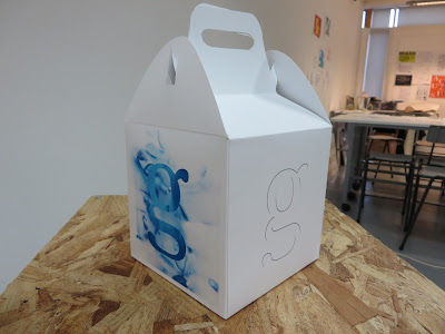
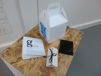
After I had finished the box I also decided to make a letter template asking for work experience. Overall I think I have made a good start at my own branding, although I know that I can push and refine this so much further. In particular my business card needs more work as I don't think the design works as well as I thought it would, next year I want to focus on how I could improve this. One of the strongest things that came out of this project is my logo, I believe it to be bold and iconic, I am really happy with how it turned out and hope to develop a strong brand around it. I have found this project to be extremely challenging as I couldn't seem to grasp at a design that represents me. As the course goes on and into next year I think I will be more sure of myself as a designer and know how to properly brand myself.


Feedback:
The packaging and logo is minimal and classic looking, (the black logo sticker is really cool) the choice of using the blue texture within your brand shows that you are still in the experimental phase of your design practice therefore it communicates effectively. The possible improvements would be to have less white space on the packaging and maybe use the blue texture more throughout the design.

OUGD402 Studio Brief 02 - Self Branding - Ideas

Today I decided to crack on with the production of my self-branding. After printing the business cards on two different types of stock I came across a problem when putting the folds in. I really struggled to line them up and when I cut them down I had one side longer then the other which wasn't what I had anticipated.

First I tested to see what the business card would look like on G.F.Smith MarlMarque Marble White 300gsm:


I really like the effect of this paper as it is subtle and gives a nice contrast against the black of the type. However I don't know if this marble effect is a bit to cliche and predictable, I want to go for something that is a little different. I also think this paper would work better as a flat design rather than a folded up piece like this.

Next I tried another G.F.Smith stock, Peregrina Majestic Marble White 290gsm:


This was my favourite stock as it appears to be just a plain white stock, but under the light it has a iridescence shine. It is a stock which is playfully and quietly flashy with an added sparkle, which I feel represents me well. It also has a starker contrast as this is more white compared to the white of the previous stock.

Feedback:
People seemed to prefer stock two's shimmery design as it is very subtle and they felt that subtly reflected within me as a designer. They also thought that I had a strong, eye-catching logo and the marble effect of the first one draws they eye away from that too much.

Final design choice:
I decided to go with stock two as this was my personal favourite as well as receiving good feedback for it. I added the ribbon and a final touch to tie it all together.


Next I printed out my box net, A2 on matt as suggested by the technician, apparently satin will crack more when putting the folds in, so it is more likely to ruin the design. 


I had to cut my net out using a scalpel and put the folds in. I would have got a better produced design if it had already been cut out and the fold put in with a machine. I had to get someone to help me put the folds in but it still worked reasonably well. The problem I had was cutting the hole out of the handle as it was really fiddly and I didn't do the best job. Eventually I glued it all together and it seemed to work okay but I will need to work on this a lot more to improve it for future use.

Sunday, March 6, 2016

OUGD402 Studio Brief 02 - Self Branding - Ideas

I began to start thinking of a business card that I could create for myself that is slightly different from the normal business card. Taking some jewellery packaging as inspiration I could immediately see how this could be turned into a business card while hinting at my love for packaging.


I have selected 3 different types of stock that I would possibly use for my design:


I have come up with a simple design for my business card which hopefully will work effectively when printed.


Thursday, March 3, 2016

OUGD402 Presentation Discussions

Today we got into small groups to talk about our presentations. We discussed any concerns or worries we had and what the content and style would be. I found this to be extremely beneficial as I have been worrying quite a lot about the presentation. I am not a confident speaker as I get very nervous when presenting, so talking through what I could do to help make myself more at ease was something I found useful. It also become more clear in my mind what was being asked of me and I now have a better understanding of the things that I need to cover. Initially I was concerned with the amount of time and whether i'd be able to stretch my presentation to fit the 7 minutes. But, I believe now I know what to include I have a better chance of achieving this. I also need to be careful not to rush through and speak quickly, if I get nervous I just need to take a deep breath and help calm myself down. To help decrease my nerves for the presentation I am going to do some research into designers who present and watch there style and the way in which they do it. I will also plan it out ahead of time so Im fully prepared and I have less chance of messing it up. 

Our group thoughts about our presentations:


Wednesday, March 2, 2016

OUGD402 Studio Brief 02 - Self Branding - Ideas

Today I began further experimentation, adding my name to the logo.


I think that my favourite has to be the bottom left as I think it has a more pleasing composition and the text works well at a smaller scale. I began to think of how I could move it away from a black and white design, and how I could bring more visual focus to the logo.

Foiling:
After looking at some business cards, I really liked the technique foiling. It is a clean, eye catching enhancement to a design which helps highlight it's beautiful simplicity. I feel this technique would represent me well as I like to keep things simple and engaging. If I used this technique for my logo I feel it would help me stand out, in a quiet way that isn't too over the top and boastful. Below are some examples of foiling that I really engage with.


Before I try out this technique properly I wanted to see what it potentially could look like by mimicking it in photoshop:


This has helped me quite a lot as now I can actually visualise what it could potentially look like if done properly. I don't think that I would go for gold, I much prefer it in silver or blue as it is a sleeker classier approach.

Embossing:
Another approach that I really liked due to it's simplistic nature is embossing. It helps to enhance the three dimensional look of the print, it makes people want to run there fingers across it and take a proper look. Below are some examples of embossing on business cards.


Again I wanted to see a digital interpretation of this technique so that I don't wast time and resources doing it if I don't like it.


I particularly like this emboss print because it reflects the fact that I am very much there as a designer but I may not shout about my presence, so this is a method I would also like to test out.

I then began to look at ways different ways I could present myself:


I really wanted to incorporate packaging into my design because of my passion and love for packaging design, it is also something I hope to go into as a career. For this reason, after seeing a happy meal box I remembered how my first ever job was working at McDonalds and I worked there for just under 3 years. I thought it would be quite nice to pay homage to that being my first job and where I'd potentially like to be with my career in the future. Therefore I would like my self-branding to be packaged in a similar box to a happy meal.

I found this net online which is similar to a happy meal box:


I printed it out and made it up to see what it looked like:


Unfortunately I hadn't noticed that all the sides weren't equal squares, so Im going to take the net into illustrator and create my own from it.

This is the net design that I created:


Unfortunately the first test I did the sides were too short so i've extended to the top handles to see if that works better.

I also decided to print some vinyl stickers as part of my pack:


I decided to print stickers out so that it could potentially become a strong iconic logo, people would recognise the logo and immediately be able to associate it with me.

Tuesday, March 1, 2016

OUGD402 Whitewall Galleries

Whitewall galleries in Leeds city centre was not what I expected at all, looking small on the outside but actually spanning across 3 floors inside. At first I was a bit apprehensive to look around as it looked like an expensive, high-end gallery. However, the women on the front desk assured me it was okay to take a look round and offered to answer any questions that I might have about the artists etc. The gallery was focused on fine art in a range of medias, I took inspiration from paintings that used bright colours to represent a scenery or landscape, they were immersive and the vivd colours really captured the beauty. Colour is something that I would like to work more with often and appropriately.


Inam


 Johnathan Shaw


Carl Shanes