Wednesday, March 29, 2017

OUGD502 Studio Brief 03 - Life's a Pitch - She is

Life's a Pitch:

TEAM:
Georgina
Emma
Courtney
Katherine

We decided to work together as being female creatives we all felt that it was important to support and promote one another. Our interests are all different which allows for a range of topics to be covered. The other members of the team are also driven and very focused which I think will help me with my own practice.

SHE IS 
Is a collective of 4 female designers who aim to promote all spectrums of art and design by females. To encourage them to be proud of their unique personalities and talents. Giving them a platform to get their work out their and increase their own self confidence. It will also work to connect students and professionals with the same interests.

Our values:
- Be yourself
- Be passionate
- Be inspired

These values should be shared with anyone taking part.

Target Market:
Female creatives primarily but anyone can participate with the same values as the collective.

Form:
Initially we want to start off a social platform through, Instagram, Facebook and Twitter where we would show off creatives works. Then we hope to move further and produce a publication which showcases our favourite work, this would be on a monthly basis, with possible themed issues. This will benefit us by connecting students and professionals.

Costs, charges and financial considerations:
Initially we would struggle to get finances as we would need a reputation first. However, this could be resolved by asking family a friends to help. There is also the possibility of setting up GoFund me page for the publication.

Responsibilities:
Publisher
Editor
Content
Contacts
Social Media
Finances

Promotion:
We aim to promote our collective on social media and through word of mouth. We also are going utilise the colleges connections. 

Contacts:
Women in Print - Manchester
Lord Whitney - Leeds
Buttercrumble - Leeds

Presentation:


Creating a platform to celebrate and promote female creatives.


Our values….


These platforms will be used to showcase female artists and designers who have similar values to the collective and want to be involved. Encouraging them to be proud of their unique personality and confident in their own practice.


We are hoping to create a zine featuring individuals that we showcase through social media, the content will be interviews and examples of there work. This will help us to explore our digital and print skills, as well as engaging further with the design world, it will develop our communication.


Thursday, March 16, 2017

OUGD502 Play It Loud: Gig Poster Goodness - The Return Of New Analog

Play It Loud: Gig Poster Goodness - The Return Of New Analog
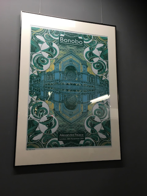
At this exhibition New Analog an illustrator from Manchester exhibited his screen printed gig posters. He's created official artwork for artists ranging from The Orb to The Wailers, Horace Andy and Lee Scratch Perry, major festivals, American tours, and a whole series of work for Bonobo. The posters are extremely detailed and I was amazed that they were screen printed as this is something I really struggled with. It has made me aware of the possibilities with screen print and it is something that I want to try again with as the outcomes can be amazing. The illustrative style made for really engaging pieces of work with strong visuals. I have always liked illustration and I really want to try and incorporate it more within my work or possibly working with someone from illustration in 3rd year.


Thursday, March 9, 2017

OUGD502 3rd Year Illustration Exhibition

3rd Year Illustration Exhibition:
Going to the 3rd years illustration exhibition was really inspiring to see what other people at LCA on other courses are doing. The work that was displayed all varied in style which made for an eclectic exhibition. It has also opened my eyes to potentially working with an illustrator in the college as there are so many exceptional illustrators at LCA. I also want to try and do more illustration myself, and not lack so much confidence in my drawing abilities. I think that if I practice more and try not to care so much about what other people think, it will allow me to feel more relaxed and I will probably produce much more natural and better work.


Tuesday, March 7, 2017

OUGD502 Presentation Practice (Design relating to social, political or ethical change)

Presentation Practice (Design relating to social, political or ethical change):

The task is to identify a piece of design that relates to our Design Practice 2 module, meaning it has to be related to social, political or ethical design. I have identified two pieces of design that hopes to have a social impact within society.

Skittles gives up its rainbow for Pride


- To celebrate gay pride.

- Design / idea from adam&eveDDB (communications agency - company made up of people from advertising, design, digital, technical, social media and direct.)

- 2016

- Open letter addressed to Pride in London:
“So this is kinda awkward, but we’re just gonna go ahead and address the rainbow-coloured elephant in the room. You have the rainbow … we have the rainbow … and usually that’s just hunky-dory. But this Pride, only one rainbow deserves to be the centre of attention – yours. And we’re not going to be the ones to steal your rainbow thunder, no siree. That’s why this weekend, we’re giving up our rainbow. But don’t worry, we’ll still be there to celebrate every colourful minute with you, we’ll just be completely starkers while we do it. Have a great day, Pride. From Skittles.”

- A colourless Skittles float joined the parade, they gave out monochrome packets of their sweets, ads displayed, social media campaign with #onerainbow

- Humorous tone, keeps the message light and has better engagement.

- Sparks conversation

- The organisation of type helps to add visual appeal and works cohesively with the content to make sure the message is clearly communicated.

- Minimal design helps to clearly communicate message - the stark contrast to their normal design provides a high impact design.

- Downfall is Skittles are effectively using the occasion to drive sales, but because the message is strong it does help to raise awareness and bring recognition.

https://www.creativereview.co.uk/skittles-gives-up-its-rainbow-for-pride/

Signs for the homeless - Kenji Nakayama and Christopher Hope


- Started in 2011

- Raise awareness about poverty and homelessness around the Boston area.

- “A sign in exchange for donations and a hand painted sign.”

- Document with a before and after photo of these people they swap signs along with a brief interview offering some insight into the individuals circumstances.

- Signs are bright and colourful to attract attention to their needs. They feature all the same text as their old piece including any misspellings and grammatical errors.

- The goal is to aid these people by giving them attention when they are usually overlooked, to an extent humanising them.

- Creates a connection with people.

- "It’s important, but when it comes to helping homeless people, it’s just a sign—now it’s more about the story about the people that is what matters," said Nakayama. Makes people want to find out more, so project has another layer. 

- The sign becomes a talking point about the real issue at hand and where change can happen.

- "my hand-painted signs are kind of like bringing a story to the public about the people I exchange the signs with,” said Nakayama.

- Project has drawn criticism, including exploitation of the homeless and the fact that people may not believe they are homeless and not take their situation seriously with a 'flashy' sign.

- Nakayama, who works full-time at the Boston-based Best Dressed Signs, where he does hand-painted logos for local businesses, has received artwork and offers from the U.S. and abroad, all wanting to be a part of the project.

- The sign is a starting point, it's to get people thinking about what more can be done to help the homeless.

http://mymodernmet.com/kenji-nakayama-christopher-hope-signs-for-the-homeless/

Presentation:


Last year Skittles decided that they wanted to do something to show support and celebrate gay pride.


With London’s Pride coming up, Skittles decided to drop their rainbow to really big up Pride, create conversation, drive awareness and show support.


This is their monochrome packet which is quite a stark contrast from the original. It created a buzz people were asking questions wanting to know more.


The communications agency adam&eveDDB designed an open letter addressed to Pride in London.


So this is kinda awkward, but we’re just gonna go ahead and address the rainbow-coloured elephant in the room. You have the rainbow … we have the rainbow … and usually that’s just hunky-dory. But this Pride, only one rainbow deserves to be the centre of attention – yours. And we’re not going to be the ones to steal your rainbow thunder, no siree. That’s why this weekend, we’re giving up our rainbow. But don’t worry, we’ll still be there to celebrate every colourful minute with you, we’ll just be completely starkers while we do it. Have a great day, Pride. From Skittles.


- The humorous tone helps to keep the message light which has wider audience engagement.
- The organisation of type helps to add visual appeal and works cohesively with the content to make sure the message is clearly communicated.
- The minimal design also helps by creating a stark contrast to their original design which provides a high impact.
- The potential downfall is Skittles are effectively using the occasion to drive sales, but because the message and gesture is so strong it does help to raise awareness and bring recognition to the celebration.

Due to another session with visiting professionals I wasn't able to actually do my presentation. However, putting the presentation together and looking at layout and organisation has allowed me to further practice getting it right. I also practiced the presentation to myself, so although I didn't have an audience I was still able to get better at other things.

OUGD502 Saul Studio Talk

Saul Studio Talk:


Dan from Saul Studio came in today to talk through his work and give us some helpful advice. While studying graphic design at Leeds University he decided that he wanted to be proactive with his work and even set up his own publication, 'The Yorkshire Boast' where he commissioned an illustrator to help. He encouraged us to start doing things now to really push our skill and passion. 

Initially he set up as with a friend as 'Logan and Saul' but his friend decided that graphic design wasn't for him. This encouraged Dan to be a lot more self initiated, and wanting to do his own projects, such as 'The Coffee Shop Project'. He approached a photographer, Justin Slee, after seeing his ballet photography exhibition. They agreed to work together to put together a publication of coffee shops in the north (Coffee Shop North). To fund the project he had to set up a Kickstarter, which means he had to give 'gifts' for donations and he was only allowed the money if the target was met.

He had underestimated the overall cost of certain aspects but still managed to publish his book. There was also an issue of thinking further regarding distribution, but he still managed to get his book stocked in Berlin / Tokyo. It was also nominated for a Best British Book Design and Production Award.


He passed his publication round for us all to get a better look and feel. I really liked the publication as a lot of care for stock and finishing techniques had gone into the design. The typeface is unique and has lot's of character. 

Dan has also worked on identity, film, apparel, record, catalogue, poster, booklet, exhibition and editorial. 

He mentioned that he has done a design for the identity of The Hepworth Prize for Sculpture but his idea didn't get chosen. I thought that showing the work for that brief was really important, to be proud of what you have done even if it doesn't get chosen for a brief.

Top tips:
- Attitude is important to make it work
- Find people that understand you and challenge you
- Collect graphic design / all design
- Find your niche
- It's not as pretty as it looks
- Make it work for you
- Important to do personal projects
- Social media important for connections

Overall I found the talk really useful as it was very honest, it was also interesting to here about freelancing as this is something I have really considered myself.

Monday, March 6, 2017

OUGD502 Berlin

Berlin:
Following on from the recent visit to Berlin, it was extremely tiring trying to fit as much as we could into a small amount of time. However, it was really beneficial to clear my head and gain some much needed inspiration. 

The hostel that we stayed in was really nice, and I think staying in this kind of environment made it more enjoyable and exciting. 


Eps51 - Studio Visit
While in Berlin we were fortunate enough to visit a graphic design studio called Eps51 who develop visual concepts across various media. There clients range from the fields of art and design to commercial enterprises. There studio has a strong focus on typography and bilingual design which I found really interesting. The way that they layout type was really inspiring, mentioning a poster where they had 3 different sizes and these could be laid out on top of each other in different compositions. This was a really strong concept and a whole new way to thinking about presenting information. It has encouraged me to try and experiment more with typography next year as it has so many potentials. I thought the way that they worked a lot with Arabic was really amazing, expanding their talents between a different language and culture. 

They also mentioned how they only worked on projects and with people that share the same values and beliefs as them, this is something that I personally believe is really important rather than selling out yourself. They talked about their initial struggles setting up but mentioned how they got help from family and friends and said the main thing is to just keep producing work to help build up a portfolio. 

Overall it was really beneficial and they talked about a few projects more in depth and there journey to where they are now. In relation to my own practice it has shown that I could experiment with type and concepts a lot more to produce a really engaging piece of design. It was also clear that setting up your own studio is hard work, but extremely rewarding when you succeed. Although I don't want to set up my own company it is interesting to hear there experiences.


Hamburger Bahnhof Contemporary Art Museum
I really enjoyed my visit here because of the pop artists that they had on display. Pop art was something that I studied in art at school so for me it was very nostalgic. It was also amazing to see how large some of these pieces were, in particular Andy Warhol's General Moa. I had done an artist copy of this piece at such a small scale, so to see the original was quite shocking but also amazing. Seeing the pop art on display and the way they use colour and layout has encouraged me to be more experimental within my designs.


Holocaust memorial
We also visited the Holocaust memorial whilst in Berlin, it was eerily beautiful. The various sized concrete blocks gave off a cold, hardness which emphasised the sombre mood.


Reichstag Dome
We also managed to also go up to the Reichstag Dome which was a magnificent piece of architecture. The use of mirrors created an interesting reflective display which showed ordered fragments. In the dome you could see a 360 degree view of Berlin which was quite breath taking. It is also amazing how such a beautiful piece of architecture can be used functionally using the suns energy.


Overall going to Berlin and being around another culture was really inspiring, the streets of Berlin were full of character as street art is very prominent. Being surrounded by new exciting visual culture made me feel more inspired and excited about what I could create.

Sunday, March 5, 2017

OUGD502 The Hepworth Museum and Print Fair

The Hepworth Museum:
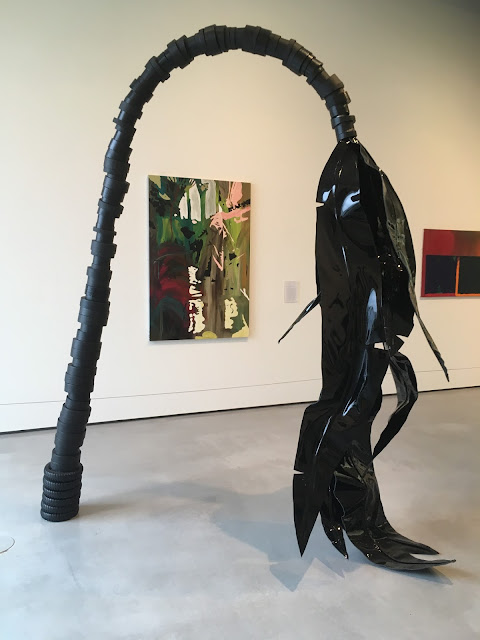
This gallery in Wakefield explores the work of major contemporary artists, most of the work that is exhibited tended to be sculptures which isn't an area of art and design which I have been particularly interested in. However, some of the sculptures were really visually engaging and very different from what I had expected. The shapes and forms that were created out of different materials is really quite extraordinary and I can appreciate the time and effort it must take to craft them. I do think that it is important to look at things that you wouldn't normally, as inspiration can come from anywhere. 


Print Fair:
The Hepworth print fair was really good, featuring over 50 printmakers, collectives and galleries from around the UK. The range of work was amazing and it has opened my eyes to the creative possibilities within traditional print. In particular one guy was doing on site lino prints, they were engaging with strong visuals, he even gathered a crowd as he printed. Me and my housemate decided to buy one each as we liked them that much. Lino is definitely something I want to try out, as I think it produced a really striking bold print. I also feel that you can be more expressive and experimental with print, I think this would benefit my own practice and encourage me to be less ordered and structured.