


Team:
- Emma Harwood
- Courtney Flannagan
- Kathryn Brown
(All from Level 6 Graphic Design)
Having worked together last year coming up with a pitch for a potential design group 'She is' we decided that we all bring something different to the table, and we could combine our skills to work on this brief.
At our first meeting we decided on who we were going to do the design for, we chose Ileen Gallagher because we liked the work that she does and engaged with her more. We also came up with a time plan as we were working on a tight schedule.


Discussing our strengths and weaknesses, Courtney had the most experience on AfterEffects so therefore would work on the moving image while the rest of us came up with concepts for the poster.
My Initial Sketches:


Once we had come together we decided on a typeface that we were going to use and the overall design of the poster, combining our different styles together. We decided to use icons which represent Ileen in some way.
My digital design:

Group poster developments:
Initial poster layout design from Emma, colours taken from Ileen's website.
Toning down the vibrancy of the turquoise and applying the icon design.

We decided that the cubes weren't very relevant and it would be more appropriate to use the LAU's shape.

We added in the text and appropriate logo's but we still felt that it looked awkward and didn't quite flow with the design.

We decided to change the whole design as we were still unhappy with the result. We inverted the icon design to be in the middle shape and stripped back the colour, having bright pops to create interest. After asking for some feedback it was suggested to apply the hexagon shape behind the text to make the title stand out more. Information is also laid out more clearly and is easier to read.

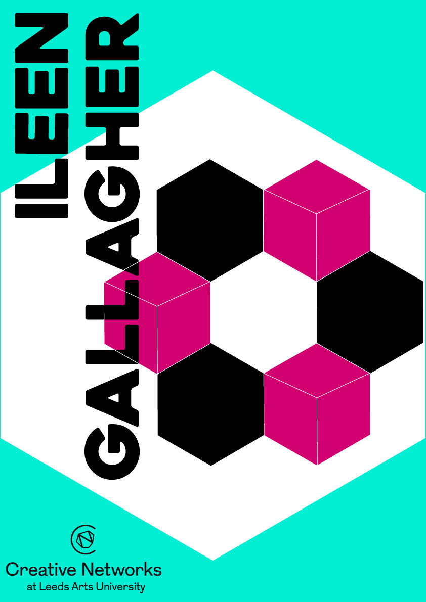
Final Poster Design:
The group felt that pink needed to be incorporated into the design as this is the colour that makes up Ileen's branding. One of the hexagon's was changed to pink as well as the date. I was unsure about changing the colour of the date as I felt it looked more consistent being black. We also organised the information clearly at the bottom of the poster.

Flyers:
FRONT - we decided to use the icons as a background pattern and again using the LAU logo shape to connect with the university. We produced the flyer in two colour variations.


BACK - we kept the design simple but still reflecting the main poster.

As Courtney is the most experienced using after effects, she created a short moving image.
Outcome:
Unfortunately we didn't win the brief but I still enjoyed working together with people on a project. We were able to combine our design skills to produce something very different from what I would usually do. It was also good working to such a short time scale as we had to produce ideas/designs quickly.