LAU Alumni - Abbie
- Found her internship and her first job through Linkedin - this shows that Linkedin can be a route to find a job.
- Think about doing freelance work as this will set you apart from the competition and will teach you about professionalism.
- Abbie went travelling after graduating which gave her space to relax and take a breath from design and allowed her to transition into work.
- Started her first job at UYR which is a studio/printer that does work for bars/restaurants, wasn't for her and only worked there a month.
- CRAFT in Leeds is a recruitment agency which is good for design jobs.
- Go to networking events to get yourself out there to be recognised.
- Now works at We Are Vista
- Make sure your self-branding is good because you never know who may pick up your card.
- Don't disregard big agencies as it could be really beneficial.
- Junior role - art-working, working alongside higher up, more responsibilities as you progress.
- Push yourself because you'll be constantly learning new things.
- Opportunities to get your work out there.
- Good questions to ask: - Progression opportunities / design and digital.
Overall Abbie's talk made me feel a lot calmer about getting a job and putting in the time to search for something that you think will be most suited to you. It was also a relief to hear that you can still get a job if you don't get one right out of uni.
Thursday, April 19, 2018
Tuesday, April 17, 2018
OUGD602 Personal Branding - Creative CV
Personal Branding - Creative CV
Now that I have a typeface and style to work with I need to create a CV that stands out and clearly presents me.
Examples:

I really like how this CV is presented like a newspaper, it's an interesting and different way to present yourself.

I think that this idea works really well, it also links more to packaging. The back of the leaflet could also fold out into a poster.

I like the simplicity and the bold type to grab attention.
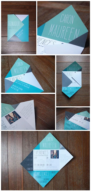
This is also an engaging way to fold up a CV.

This reflects an interest in packaging design due to the nature of the design.
I need to think about layout and how I want to best present the information to reflect me, while remaining clear and legible.
What to include on a CV?
- Personal Details: Full name, email address, phone number, address, website, social media.
- Personal Statement: Achievements, career aspirations, tailor to job role applying for, overview of who you are, strengths, work experience / education, skills, hobbies and interests that demonstrate skills which are relevant.
Why does this role interest me?
Why am I suited to the role?
Do you have any previous jobs or training that relate to this line of work?
Have you taken part in any projects that help demonstrate your capabilities?
What specialist skills do you have that make you an ideal candidate?
- Work Experience: Relevant, transferrable skills, examples.
- Education: Institutions, dates of attendance, achievements, grades.
- Skills and Qualifications: From work experience of education relevant to the role, key skills.
- Interests and Hobbies: Relevant, add value.
OUGD602 Personal Branding - Business Card Stock
Business Card Stock:
As I've got quite a simple design I want to have a good stock which looks sleek and professional. Im going to have a look on G.F Smith as they have a wide range of stocks in different colours and textures.
Colorplan - Cool Blue


Softy - White

Wild - White

Twist - White

Colorplan - Pale Grey

Colorplan - Natural

Colorplan - Ice White

After looking through the G.F Smith swatch book I noticed that some of these papers looked quite different from how they looked online. This was really useful that I checked the book before I ordered the paper.
I have decided to order the Colorplan Cool Blue 350gsm and Wild White 300gsm. I have ordered 5 A4 sheets of each so that I will have 40 cards per stock.
As I've got quite a simple design I want to have a good stock which looks sleek and professional. Im going to have a look on G.F Smith as they have a wide range of stocks in different colours and textures.
Colorplan - Cool Blue

Gmund Heidi - Faded Grey


Wild - White

Twist - White

Colorplan - Pale Grey

Colorplan - Natural

Colorplan - Ice White

After looking through the G.F Smith swatch book I noticed that some of these papers looked quite different from how they looked online. This was really useful that I checked the book before I ordered the paper.
I have decided to order the Colorplan Cool Blue 350gsm and Wild White 300gsm. I have ordered 5 A4 sheets of each so that I will have 40 cards per stock.
Monday, April 16, 2018
OUGD602 Personal Branding - Business Card Feedback
Business Card Feedback:
I've selected 4 designs which I think work well and have asked a few of my peers for some feedback.
1.

2.

3.

4.

Feedback:
The type layout for the back of the card works the best landscape, as it has a more interesting layout while still remaining ordered and legible. The two favourite designs for the logo side of the card were 1 and 2. They liked number 1 because of the more ambiguous and dynamic layout which has a good visual appeal, however it might not be as clear at that scale what it actually is. Number 2 was also favoured because the smaller scale led to a clean simple layout and the logo is more clear as to what it is.
Based on this feedback I am going to go with design 2 as it has a simple and clear design that works effectively.
Monday, April 9, 2018
OUGD602 Ey Up Glug Vs Ladies Wine & Design
Ey Up Glug Vs Ladies Wine & Design:
A collaboration between the Leeds chapters of Ladies wine and design and Glug to showcase fierce female creatives and digital practitioners.
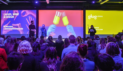
Speakers:
Malin Persson - Glug HQ
- Originally from Sweden
- Communication Design in Sydney
- Dropped out to study Graphic Design in London’s Ravensbourne
- Discovered that she preferred doing the production side of the creative industries.
- Dropping out and starting again made her realise what she really wanted to do.
- Attitude and how your present yourself is as important as your work.
Cari Kirby - Team Cooper
- Marketing manager for Team Cooper
- Struggled to come back into industry after she had children.
- Found at work that is flexible for her - part time
- Flexibility in the workplace can improve productivity
- Make life work for you
Olivia Downing - Founder of Chics in Advertising
- Comedian in Paris
- Realised no one knew who she was so it didn't matter if she failed.
- She wanted to do more things and break out of her comfort zone.
- Showed stats which showed that female creatives have a disadvantage
- Started her group in Manchester to change this and it has grown ever since.
Ellen Ling - LOVE
- Creative copywriter from Love in Manchester
- Did D&AD marketing and admin
- Taking every opportunity to discover that copywriting is her passion
- You don't need everything figured out yet and don't be afraid to fail.
I found all of the talks to be really motivational and I felt empowered afterwards to keep trying and taking every opportunity that I can get. As I struggle with my confidence it was good to point out that people don't know you so it doesn't matter if you fail because you can just keep trying again.
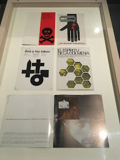
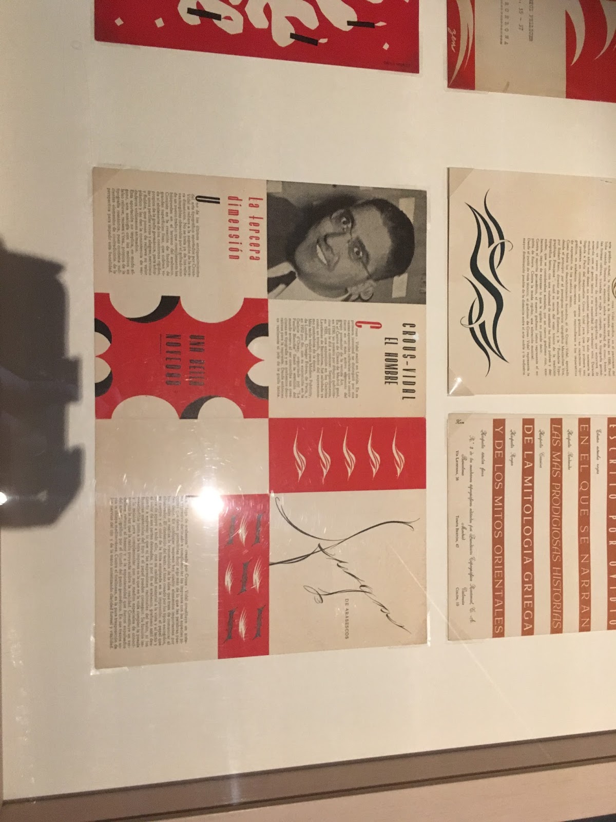
OUGD602 Design Museum of Barcelona (Museu del Disseny)
Design Museum of Barcelona (Museu del Disseny):
When I was in Barcelona I visited the design museum which has a floor of graphic design. It contained posters, book covers and prints from 1940's to the 1980's. I took photos of some of my favourite which have an emphasis on type, layout and colour.
I particular liked how they had a newspaper style guide for the museum which was really well designed with a very clear layout.


OUGD602 Personal Branding - Business Card Design Development
Business Card Design Development:
For the portrait design I chose the type layout that I preferred that creates an interesting design. I then mocked it up using one of the front portrait logo's and applied the different typefaces to the back.
DESIGN ONE
Zilla Slab Semi Bold:

Cabin Bold:

Berthold Akzidenz Grotesk Bold:

Oswald Bold:

DESIGN TWO
Zilla Slab Semi Bold:

Cabin Bold:

Berthold Akzidenz Grotesk Bold:

Oswald Bold:

I tried the 'g' logo at a larger scale to see if it has more of an impact.

DESIGN THREE
Zilla Slab Semi Bold:

Cabin Bold:

Berthold Akzidenz Grotesk Bold:

Oswald Bold:

Now that I have developed and tested out the different designs I think that the typeface that works the best is Berthold Akzidenz Grotesk Bold. It is clear and legible and has a consistent bold stroke width which makes it stand out. I think that I need some further feedback to help decide which design works the most appropriately. I also need to start thinking about paper stock and colour.
Subscribe to:
Posts (Atom)