Robot Food are a branding agency based in Leeds, they are determined and passionate and like to tell the truth of a brand in the most compelling way possible. Detail is important, they like to take the process with care as they believe that every element counts in making a successful brand.
Their services:
- Brand audits
- Brand strategy workshops & blueprints
- Brand & product naming
- Brand tone of voice and copywriting
- New product development
- Branding
- Packaging design
- Art direction
- Packaging structure
- Mock ups & visualisation
- Artwork production
- Advertising
- POS
- Web & digital
- Brand guidelines and guardianship
RF are skilled in many areas and seem to have a strong service that can provide the best for their clients.
They really take pride in their work and build brands which values are aligned with their own.
Their values:
- We’re fiercely independent.
- We never take a brief at face value.
- We’re not afraid to ask questions.
- We’re challenging, in a good way.
- We champion authenticity.
- We encourage personal expression.
- We employ on fit and ambition.
- We’re not controversial or contrived.
- We let our work do the talking.
- We work with people we get on with and believe in.
- We treat people how we like to be treated.
- We value our time and have a good work/life balance.
I think it is really important to have values as it allows them as designers to stay true to who they are and what they believe in. It is really inspiring to see this because it gives them personality and intrigue, it seems less corporate and inspires creativity.
They care more about whether the client is happy rather than winning awards.
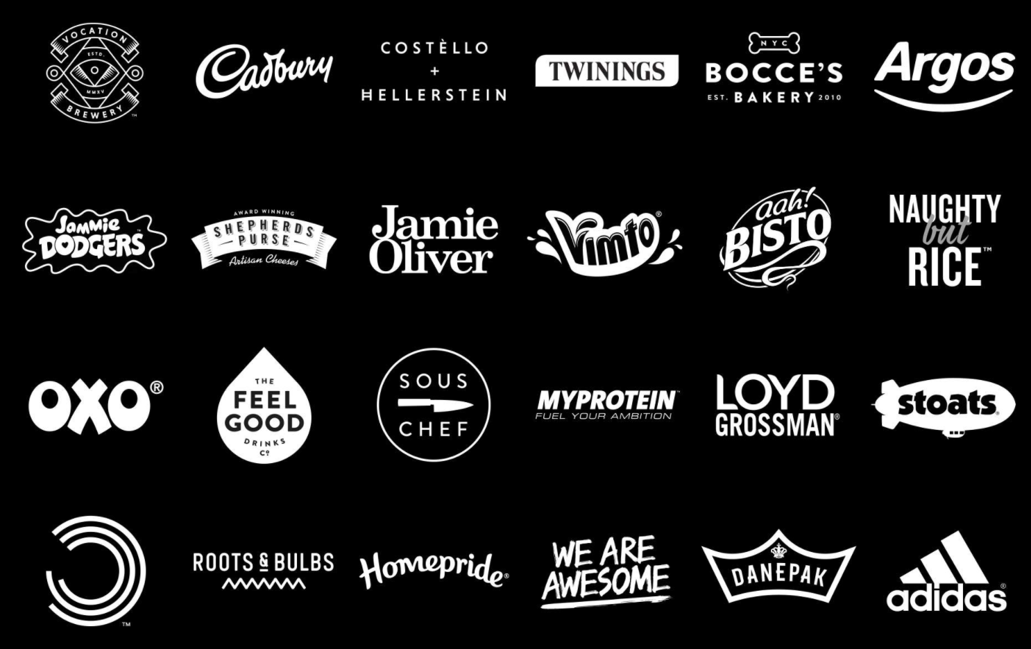
Brands they've worked with:
Work:
Electric Ink - Tattoo care
I really like this project, the strong illustrations make it extremely eye-catching and work cohesively with the product. They collaborated to produce this, and I think that really highlights how successful collaboration can be.

Naughty but Rice
Bright bold pattern flashing through a nice clean sleeve creates intrigue and hints at the mischievous nature of the product.

Roots & Bulbs
A nice simple, clean branding and identity design that really helped to emphasise the whole organic feel of it.

Cadburys Mini Rolls
Engaging type that works with the product well, such as incorporating the apostrophe and the curved letterforms.

I am really interested in this design studio, the work that they do is always bright and fun. Their work is also consistently really strong which shows the high level of professionalism. Im going to send them an email to see if I can look round their studio and hopefully do an interview with someone working there.
Email:
Hello!
I have recently come across your studio and I love the work that you do, it is bright, bold and communicates each brand perfectly (my particular fav is the 'Naughty but Rice', I love the engaging pop arty illustrations that really make it stand out). Your values also resonate with me about working with people and on projects that you agree with, I think its important to stay true to yourself and what you believe in.
Currently I am in my second year studying Graphic Design at Leeds College of Art, and I wanted to know what its like out there in the real world of design. My particular interest is within packaging design and the work at your studio is exceptional and something that I really admire! Is there any chance I would be able to come and have a look round to better understand what a real studio environment is like, as well as the exciting work that you do.
I am also interested to learn about an individuals experience working at Robot Food, and how they got into the industry, my hope is to put this together into a publication that will give others currently in study a better understanding of the journey into the world of design.
Regards,
Georgina
No comments:
Post a Comment