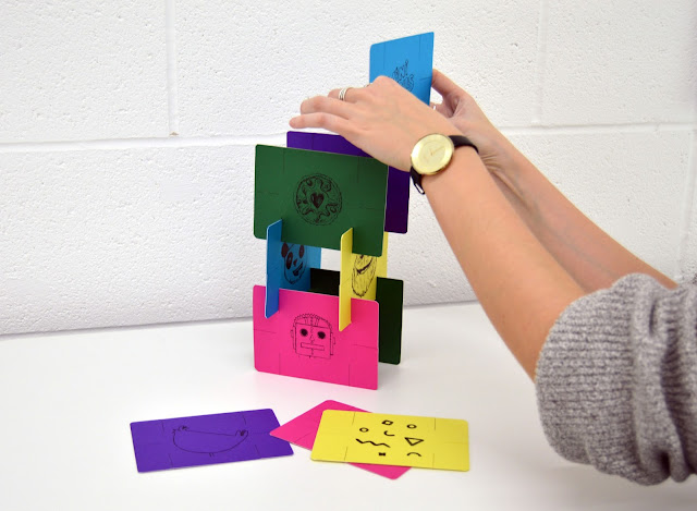
Overall I am a lot happier with my final outcome compared to last years design. The coloured stock is bright and eye-catching which helps to bring an overall engagement with the design. I did encounter some problems along the way which affected the quality of the overall design, such as printing, cutting out, and mounting. The slits on the cards are also possibly to thin but they do hold the cards a lot better than before. I hope that presenting the interview (questions) in this way shows my ability to think outside the box and do something different.
Message to Simon:
'Hi Simon,
Thanks again for getting back to me with the answers to my questions earlier this year, I really appreciate it. Using your answers I have created a set of cards, one side with a little doodle with elements from your work, and the other with your answers. These cards are intended to build together to create a structure which represents how you have built up your studio and the way in which you build strong brands. I wanted the colours to be bright and engaging similar to those in your work. I’ve sent you the outcome so you can have a build yourself!
Looking forward to seeing more work from RF!
Georgina'


